Web Development
Andrean High School Site Improvement
Sept. - Oct 2024
Final Site >
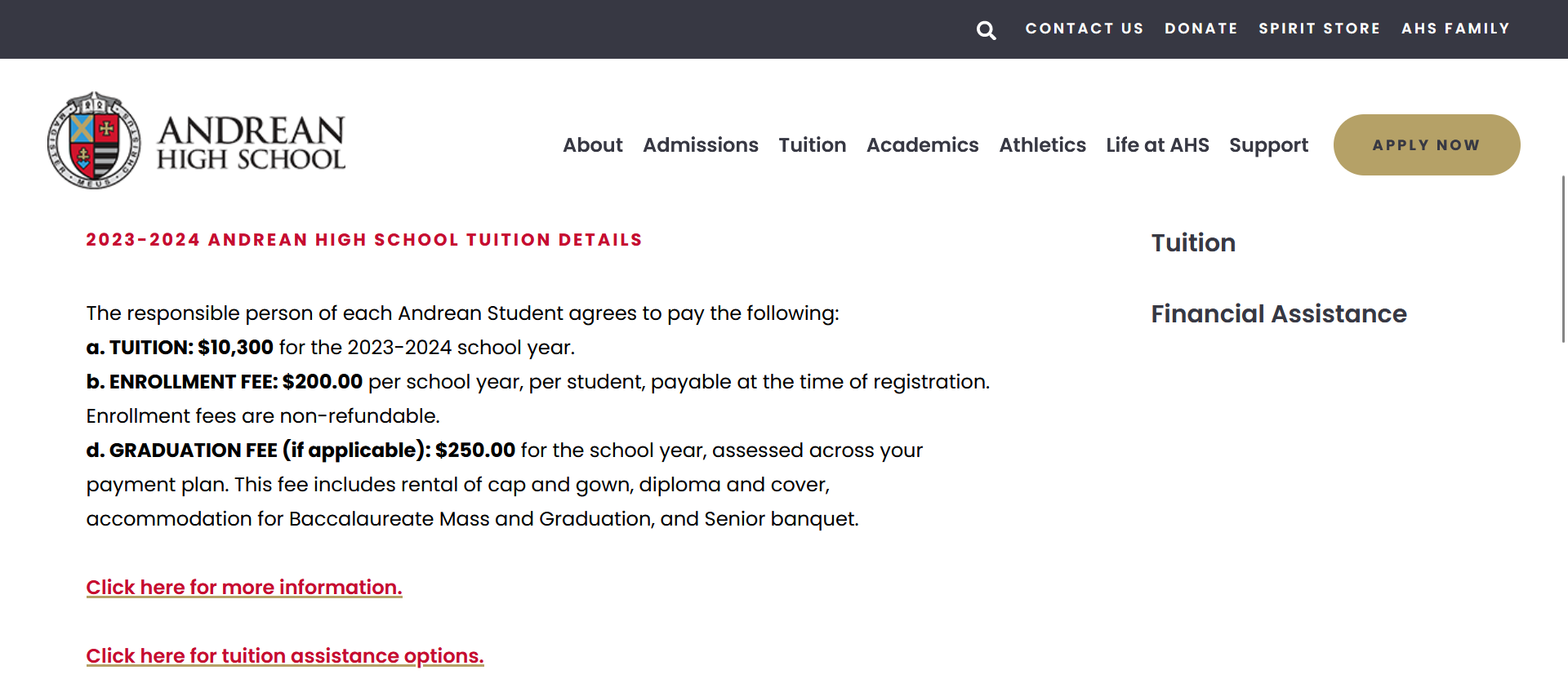
Freelance work for Andrean High School to improve the existing school site and update information throughout the school year using the FACTS site management system.
The project prioritized improving site usability and visual looks with changes that would have a great impact and were time-efficient. After a site audit, navigation better-suited for the site's users, better formatting of links, and overall consistency were determined to be the biggest areas to target.
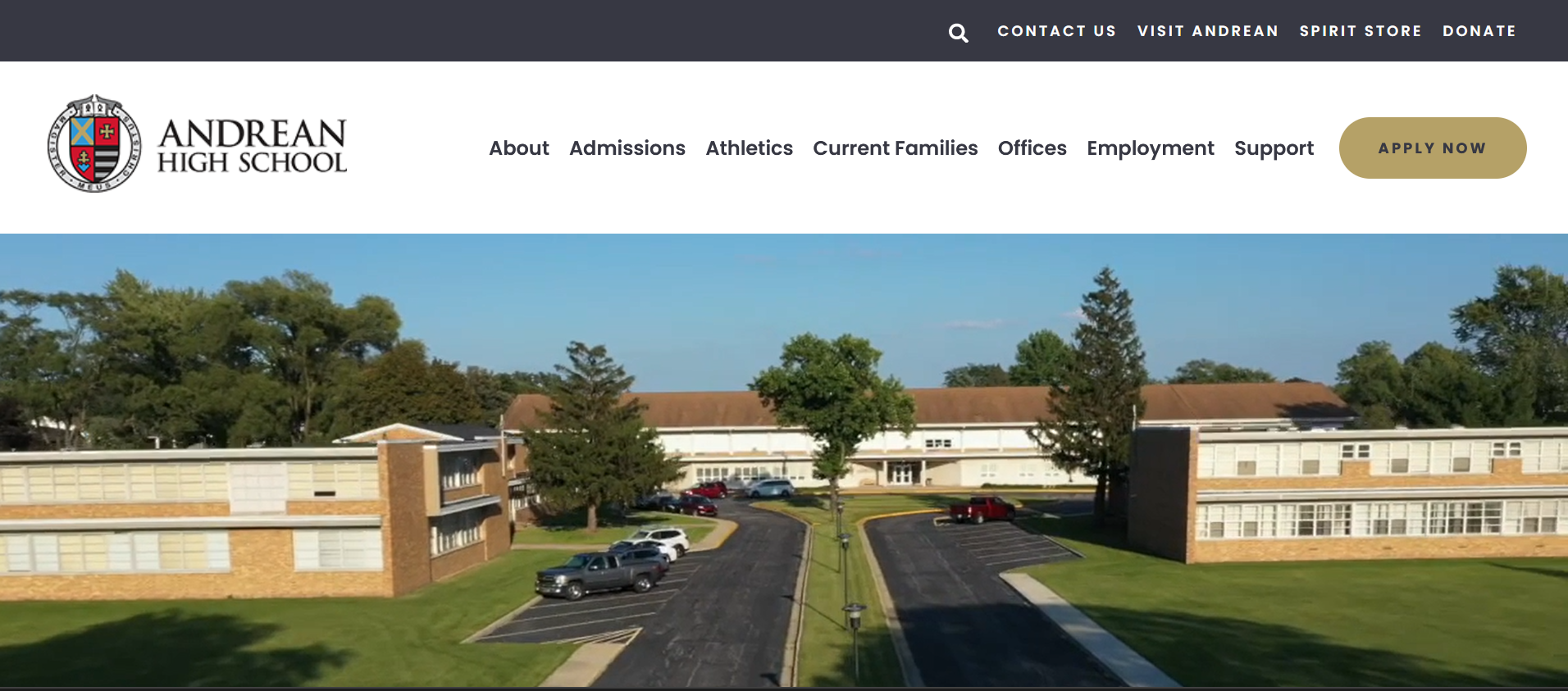
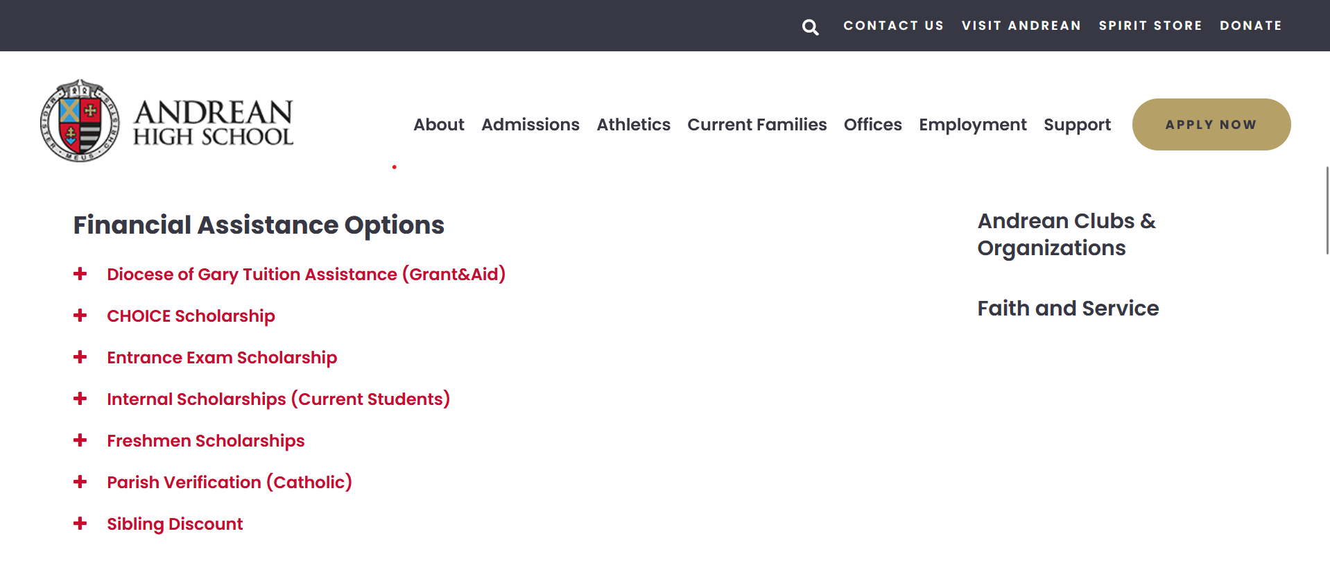
The Andrean High School homepage
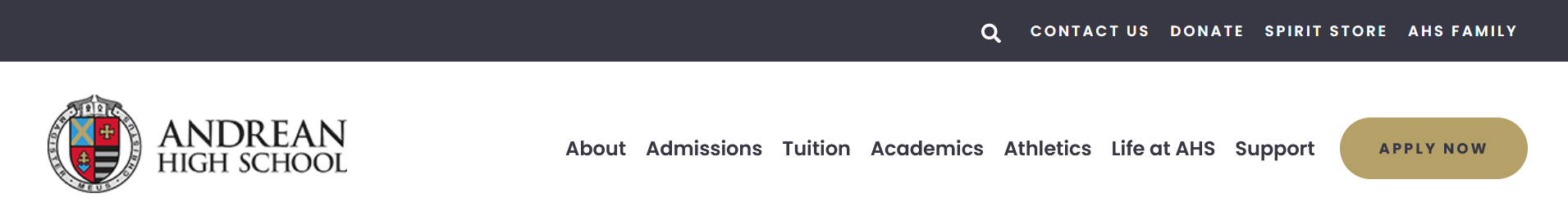
Navigation >
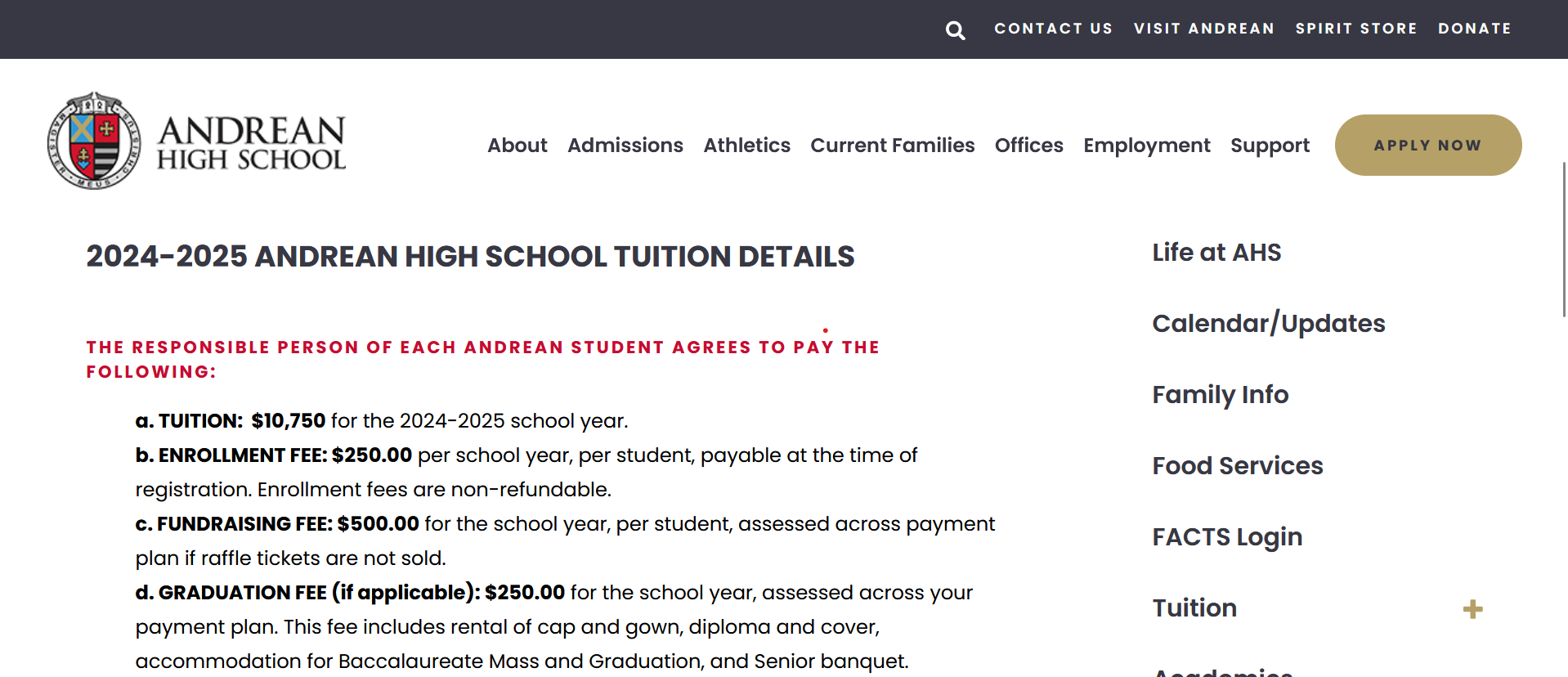
The navigation bar was changed to reflect the site's potential users: parents/students, prospective families, potential employees, and alumni looking to support the school. The submenus were changed to reflect the new navigation bar, with more important links located near the top of the menu.
>> Other navigation changes:
- Limited the About section to about page and directory and moved all pages about offices/departments to a separate Offices section.
- Replaced AHS Family quick link made unnecessary by the new Current Families tab with the Visit Andrean link that should be highlighted more.
- Moved Donate quick link to far right for better placement for user call to action.
- Limited number of subpages that would not be visible from the navigation dropdown. Necessary subpages are linked somewhere on the main page to make them more visible to users.
Old navigation bar

New navigation bar
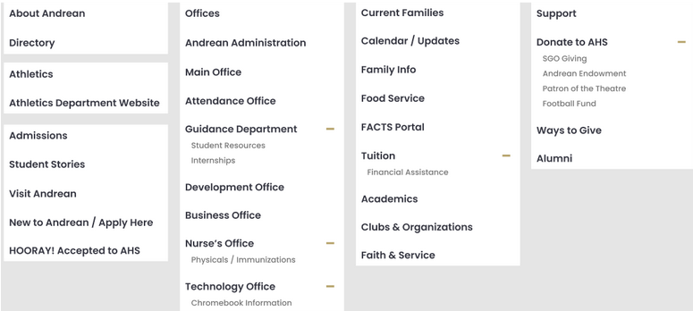
Site map of submenus for new navigation tabs
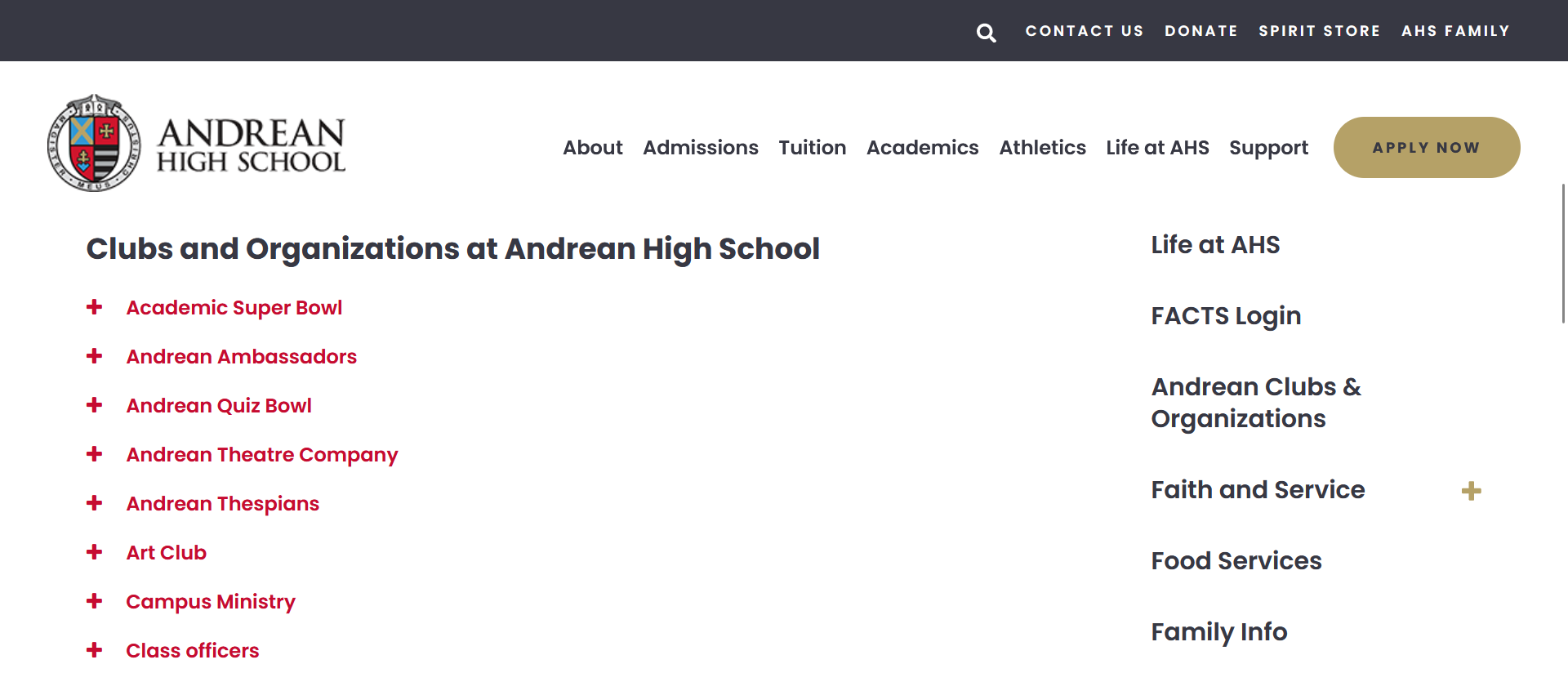
Links >
All the links look identical whether they were links to download a resource, navigate to another page on the site, or navigate to a different site. A system was designed for each category of link to look different so users will know before they click a link if they are going to be downloading something or taken to a different page or site. Download links have an download icon placed next to them, external site links have a different corresponding icon, and internal site links have no icon.
Extra spacing was added between links to improve both readability and the visual weight of the webpage.

Download icon

External link icon
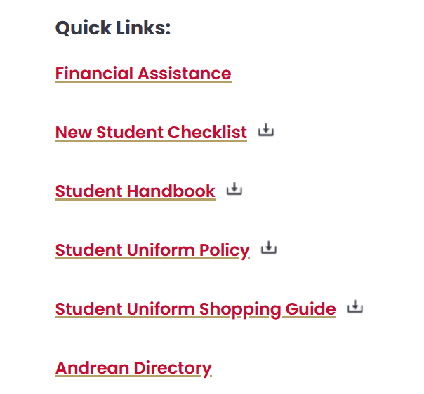
List of quick links after changes made
Consistency >
Consistency across pages was improved for link formatting/spacing, directory formatting, text hierarchy, and dropdown menus, the last two are detailed below
>> Text hierarchy
Each page had its own system for text hierarchy that was usually not ideal for readability and made the site look inconsistent overall. Each page was edited to have the same order of headings and styling. Bolded text and paragraphs was also added where appropriate to highlight important information and improve readability.
>> Dropdown menus
Multiple pages had dropdown menus, but with inconsistent styling. All dropdowns were changed to feature red text on a white background with the expansion toggle on the left.
Tuition page before and after improved text hierarchy
Club dropdown
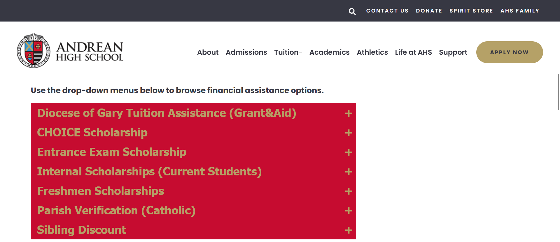
Financial aid dropdown before changes
Aid dropdown changed to match others
Style Guide Generator Custom Site Design
Feb. - May 2022
Final Site >
Site builders like Wix and Squarespace help anyone create a website, but they allow too much style customization that let non-designers make poorly designed sites.
The site gives non-designers a quiz about what kind of site they are making and gives them a style guide of five colors, two fonts, and three button styles. The results page tells users what a style guide is, how to incorporate their results into a Wix site, and why the design choices work for their site.
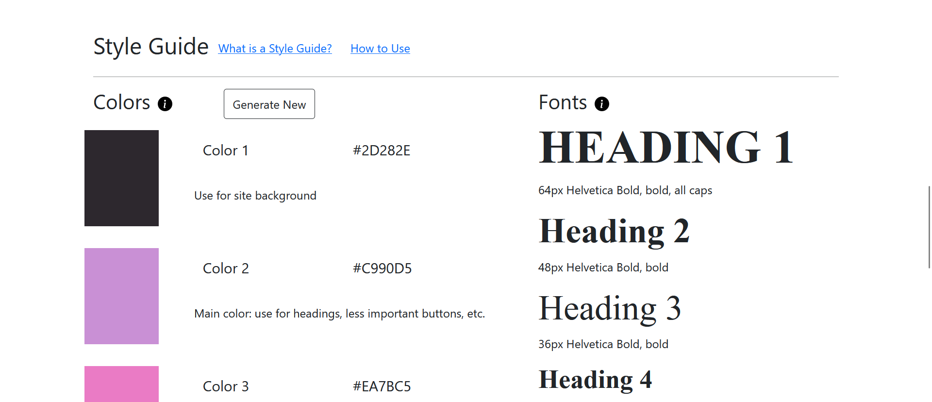
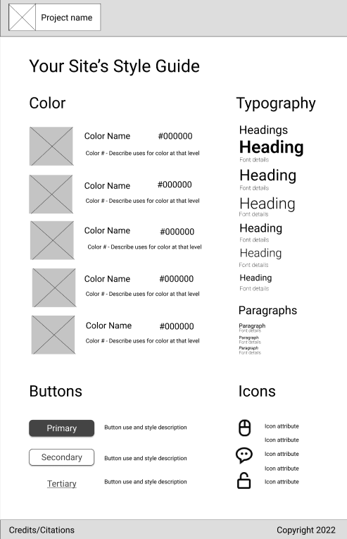
An example results page
Form Questions and Algorithm >
I first created a concept map that determine what influences my own design decisions. I used these influences to create questions about the site's content, interacitivy, and mood/feel. These questions were prioritized to determine the final decision flow.
Working with the questions and original concept map, I created decision flows for color choice, typography choice, and button design. These decision flows were combined to make the site's algorithm.
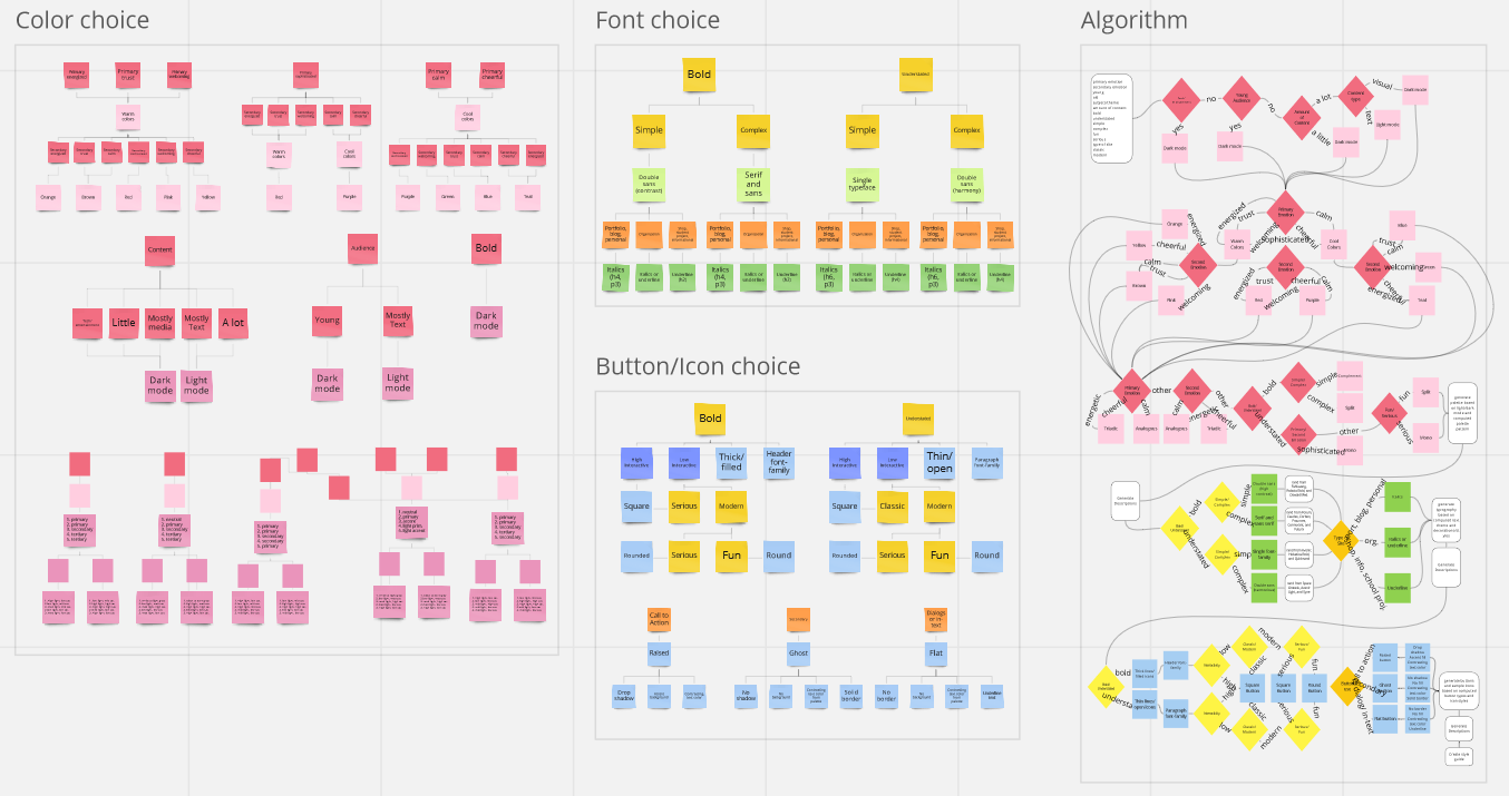
Decision flow for color, text, and button decisions with full algorithm map on the right
Wireframing >
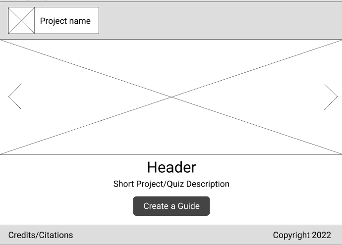
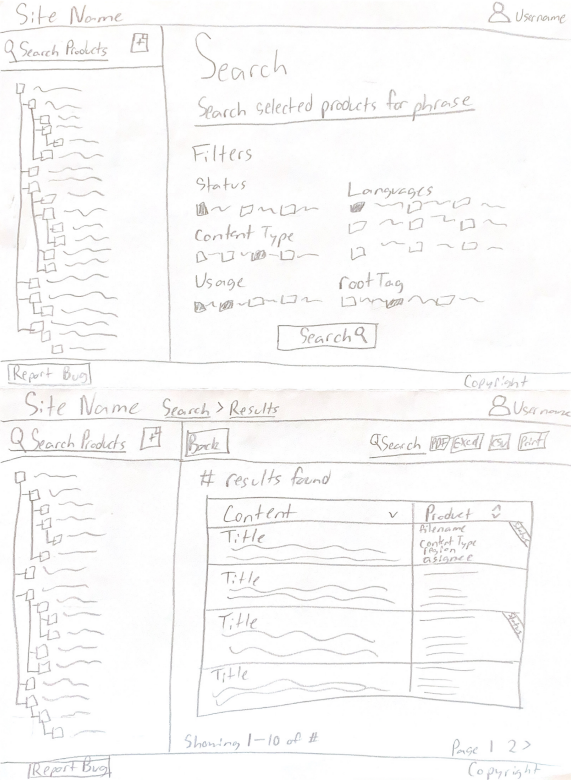
Landing page
Quiz form page
Results page
Development >
The site was developed using JavaScript to make it interactive and handle the algorithm's logic. The site is a single page application created without a JavaScript framework. Styling was done using the Bootstrap framework.
The color palette generation was the first feature tested, using end results not quiz questions. Next the base of the site and the form was built before implementing the algorithm. Once the site returned the expected results, the results page was built. The site was then changed to a single page application and context pop-ups was added to the results page.
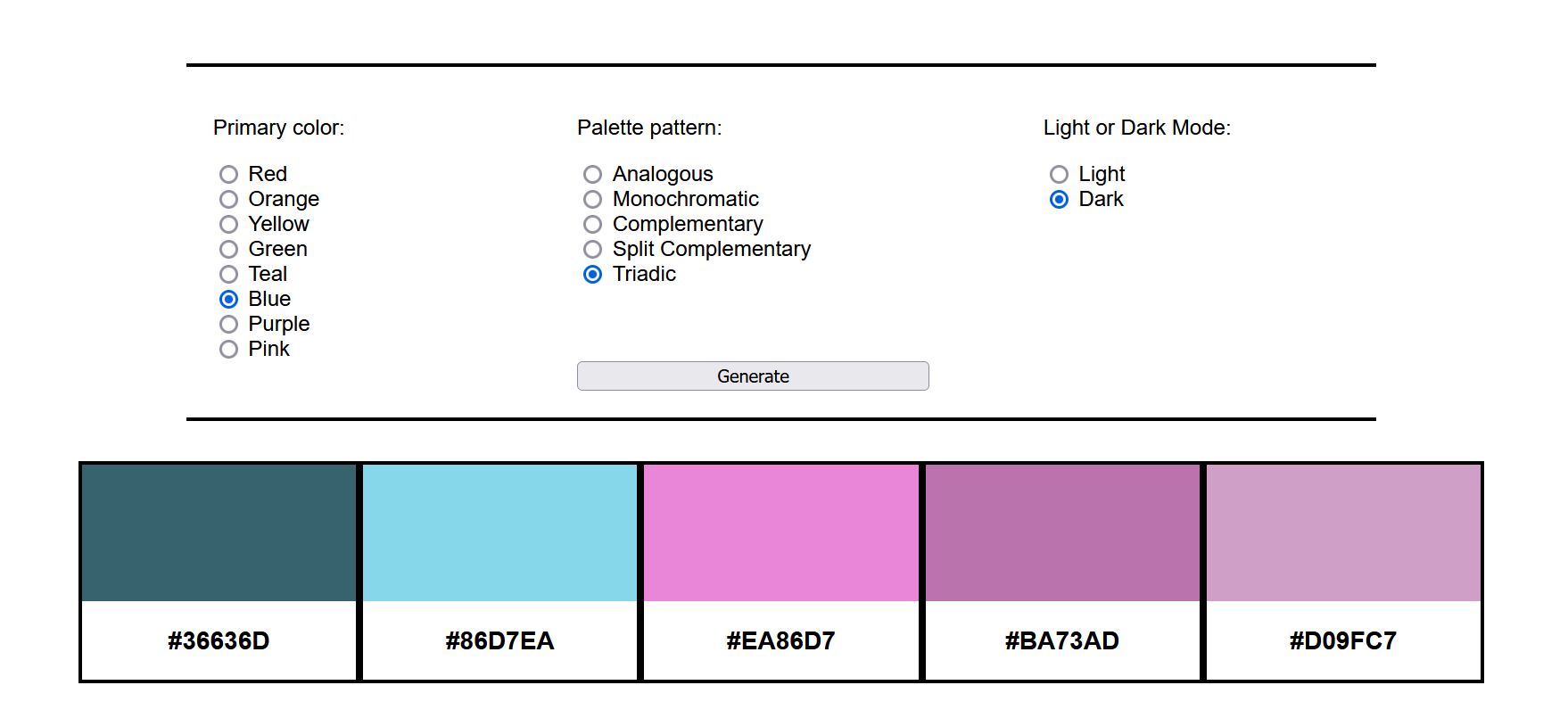
Test site for color palette generation functionality before implementing algorithm Visit site
Atlas 2.0 Global Compliance Management Redesign
June - Aug. 2022
A redesign of the internal Atlas global compliance management system used by the technical writers when writing product guides. The internal site holds the different versions and metadata for each warning and other types of compliance required in product publications in various countries.
Updates included improved jsTree searching for products and compliance items, streamlined compliance assignment and metadata edits, more minimalist visual design and UI, and assiging responsibility for compliance items from those in the global compliance department.
In the interest of confidentiality, I have only included wireframes of the site, since screenshots of the site could contain non-public information.
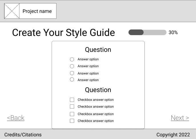
Home/search page and search results page
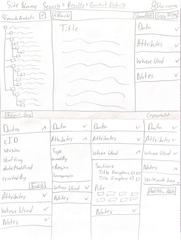
Content page and metadata expansion panels