UX/UI Design
Goodreads Redesign Exercise UX Club Semester Project
Sept. - Dec. 2022
Empathize >
The team first identified different users and stakeholders for Goodreads that would be impacted by a redesign of the Goodreads user interface.
After identifying our users, the team familiarized ourselves with the site and began to empathise with users using an empathy map. We found numerous pain points that we looked to explore in our research. After writing the initial sticky notes, we categorized the notes by core features like content and navigation.
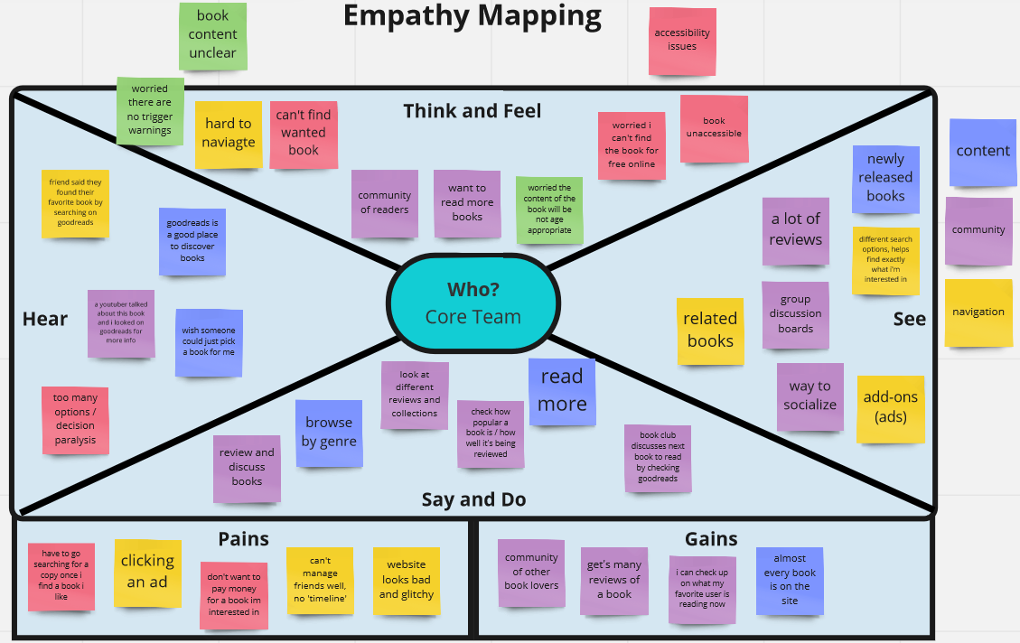
Empathy map for current Goodreads design
Research >
Research consisted of two phases: surveys and contextual inquiries.
The survey was designed for Goodreads users and non-users. The focus was on reading habits such as reading for school vs. pleasure, book recommendations, and social aspects.
Contextual inquiries were conducted with two Goodreads users and observed the users performing common tasks like logging in, searching for a book, and writing a review. The inquiries looked for pain points and common complaints/ambiguous user interactions.
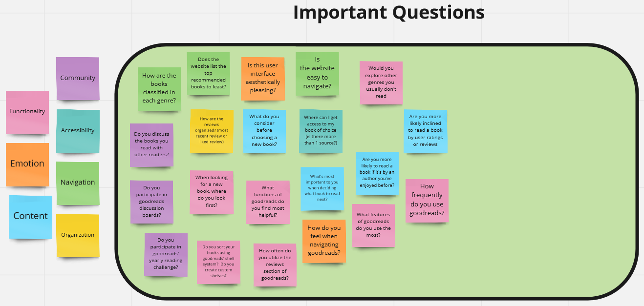
Important questions for survey and context inquiries
Define >
Survey findings were analyzed using Google Forms graphs and spreadsheets. Contextual inquiry results were discussed as a group and commonalities were noted.
Using these findings, the team created a student persona an affinity map to organize features and user habits to include in the ideation stage.
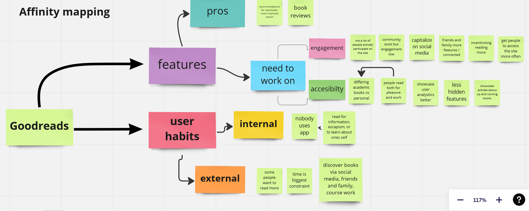
Affinity map from research findings
Ideate >
Each team member sketched wireframes for the four main screens and the app navigation, incorporating the features we decided would accomplish our goals for the redesign. After presenting our wireframes to the group, we highlighted what feature implementations we liked best for each design.
The four screens featured were home, community, my books/bookshelf, and the screen for an individual book.
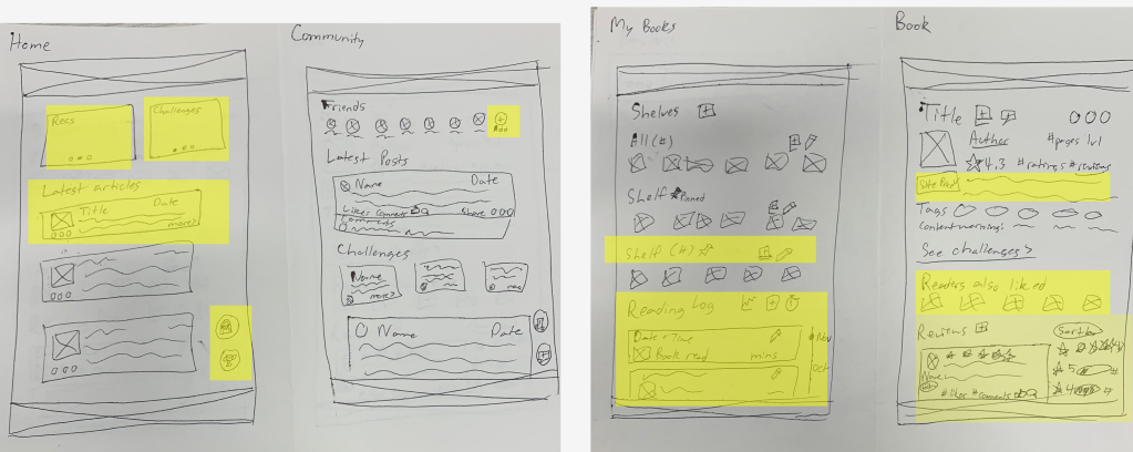
My wireframes with the group's favorite features highlighted
Prototyping >
Each team member chose a main screen to create on Figma using the best features of everyone's wireframes. I was responsible for the home screen. The Figma prototype was initially low-fidelity, before the team decided on a style and added real text and images. Prototype was made clickable to present at the UX Club end of semester presentations.
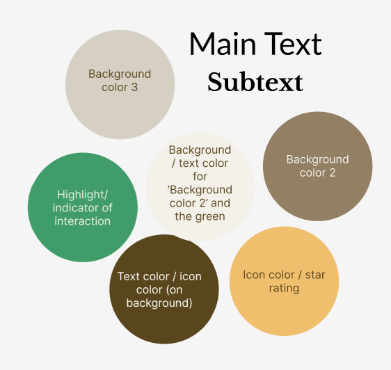
Prototype style guide
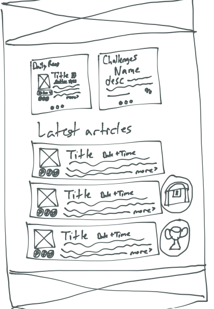
Home wireframe
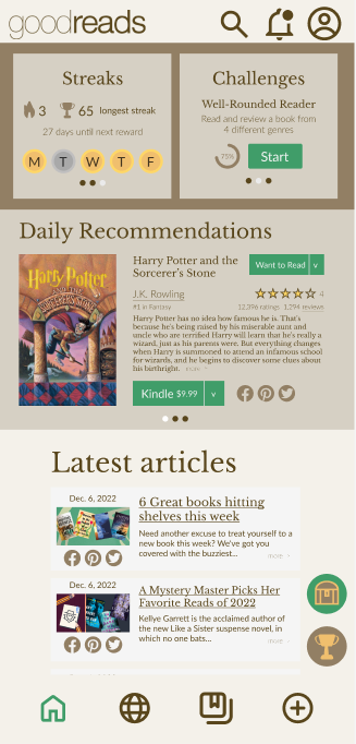
Figma prototype
etTerra Product Design
March 2022
Moodboard >
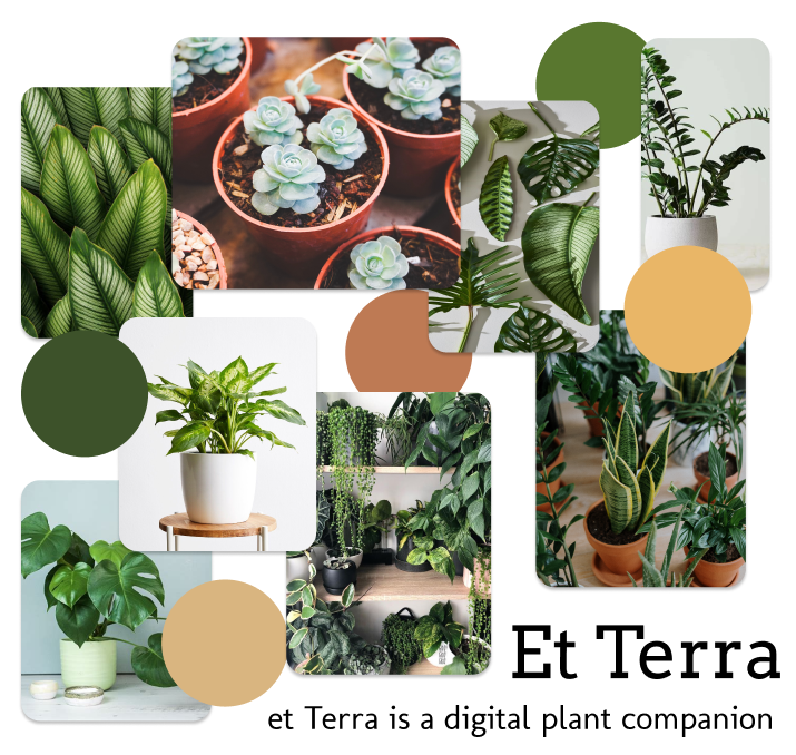
Moodboard used to present the team's visual design choices for et Terra, a digital plant companion app. The moodboard contains the colors and fonts chosen for the app as well as images of plants that demonstrate how the app's content should look and feel. The moodboard's layout was currated to communicate the laidback design the final product should have.
Component Library >
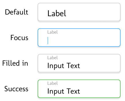
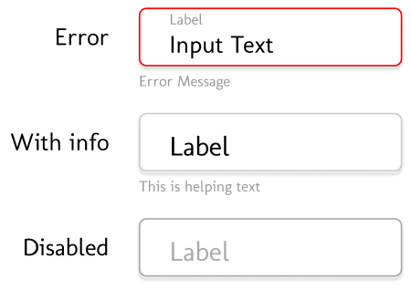
I created input field section of the et Terra UI team's component library using Figma. The design features a floating label input field interface with components for the default, focus, filled, sucess, error, with info, and disabled states. Input fields were designed with brand fonts, brand feel, and semantic colors in mind.
Visit Our Cities Website Information Architecture
July 2021
This website was collaboratively made with two of my peers. For this website, I was the information architect responsible for all written content as well as the content's organization. The site was a combination of three websites about individual cities.